Pantone’s Color of the Year 2026, Cloud Dancer (PANTONE 11-4201), sets a calming and versatile tone for interior design. This soft, airy off-white reflects a growing desire for serenity, balance, and timeless elegance in our living spaces. Neither stark nor cold, Cloud Dancer works as a refined neutral that enhances light and creates a sense of openness.
Cloud Dancer: The Foundation of 2026 Interiors
Designed to feel like a visual pause, Cloud Dancer acts as a blank canvas for interiors. It pairs effortlessly with both warm and cool tones, making it ideal for walls, ceilings, and large furniture pieces. Its understated nature allows textures, materials, and accent colors to truly shine.
Key Pantone Palettes for Interior Design 2026
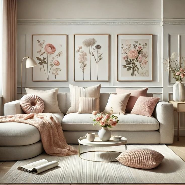
Comfort Zone – Warm & Earthy
A blend of soft browns, muted roses, and nature-inspired tones paired with Cloud Dancer is ideal for living rooms and bedrooms that feel cozy, grounded, and welcoming.
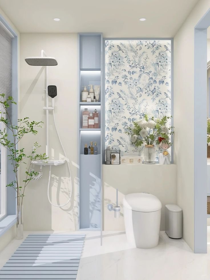
Atmospheric – Calm & Airy
Gentle blues and blue-greens layered over a Cloud Dancer base are recommended for bedrooms, bathrooms, and spa-like retreats.
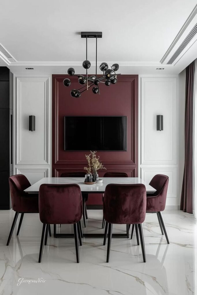
Glamour & Gleam – Sophisticated Contrast
Deep blacks, wine tones, and metallic accents balanced by soft white are suitable for dining rooms, statement spaces, and modern luxury interiors.
Take a Break – Soft Playfulness
Warm pastel and dessert-inspired hues anchored by Cloud Dancer are to be used in kitchens, creative corners, and casual spaces.
How to Use the 2026 Pantone Palette
Use Cloud Dancer to brighten rooms and reflect natural light, adding warmth with wood, stone, and textured fabrics. A balanced use of bold aaccent colors through cushions, art, or statement furniture provides a timeless appeal on neutral backdrops.
Why This Palette Works for 2026
The Pantone 2026 palette reflects a shift toward calm, clarity, and thoughtful design. With Cloud Dancer at its core, interiors feel lighter, more intentional, and adaptable to personal style, whether minimalist, contemporary, or classic.
Published: January 29, 2026Updated: January 29, 2026Author: adminCategory:Interior DesignReading Time: 2 minWord Count: 301 words

")
")
")
")